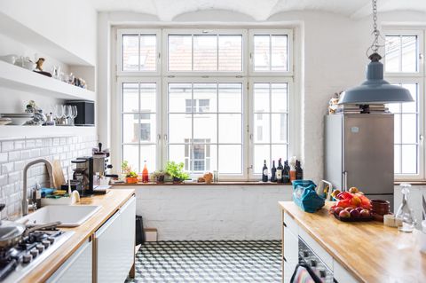
6 Things The World’s Most Beautiful Kitchens Have In Common

After double tapping and repinning hundreds of kitchens (not to mention spending the entire day, five days a week in one), we’ve become experts in identifying what draws a person’s eye to a cooking space — and we’ve noticed one really cool thing: Almost all of the spaces have some of the same things in common … and none of them are that expensive to achieve. Here are the rules the most beautiful kitchens tend to follow.
Don’t be afraid of pattern.
Joanna Gaines and Christina El Moussa have nearly opposite styles, but the two design mavens have proven a shared love of one kitchen trend. Neither can resist patterned tile. It’s the easiest way to add interest to a kitchen without overwhelming the room with tchotchkes and unnecessary clutter. Plus, if you lay them down on the floor, it takes the place of a rug, which would just get dirty with spills anyway.
Gray is the new white.
Remember when your “Dream Kitchen <3" Pinterest board looked like a blank sheet of paper? That clean white look is still nice, but homeowners have adopted a new obsession: gray. You'll see cabinets painted in every shade of the color — albeit still with white walls.
Let your lighting shine.
If track lighting was the go-to for the ’90s, and recessed bulbs were ever-popular in the early 2000s, then bold pendants are what the current decade will be remembered for. Nothing ever looks as big hanging from the ceiling as it does in your hand, so opt for lamps that look as striking as possible.
Forgo a traditional dining room.
Nothing softens a stark kitchen like a cozy seating area. Prefab nooks are surprisingly simple to order and place in an empty corner of the room, but the chicest designers know it’s how you trick out the space that matters. Mix and match textures, patterns, and colors, and you’ll make your banquette look a whole lot more expensive than it was.
Two is better than one.
Not only has all-white become passé, so has only choosing one color for all of your cabinetry. Interior decorators have begun to coat upper cabinets and lowers in different paint shades — and the result totally tricks your eye. By leaving uppers light (yes, white is okay, but so is a pale blue or barely-there gray), they don’t overwhelm a small room. Lower cabinetry can handle darker hues.
Give copper a chance.
So often we resort to silver or brass fixtures — usually because that’s what’s most readily available. Though copper has more color to it than other metals, it can still act as a neutral. If you’re shy, try a faucet or knobs to start. If you’re feeling adventurous, a copper stove hood or backsplash can transform a room.
Follow Delish on Instagram.
Download the Delish app.
